
Mar-iiiii-na, Aqua Mar-iiiiii-na, why don't you say, that you'll always stay, close to my heart.
If you don't look too hard, you may think that it's been barely a week since my last post. You poor, nescient chump. The year is 2025 and it's been a whole year since I last put fingers to keyboard in blog-thirsty anger. On the other hand the previous post was 18 months before that, so it might be considered a 33% increase in output. You may mark you calendars for my next post some time in early December...
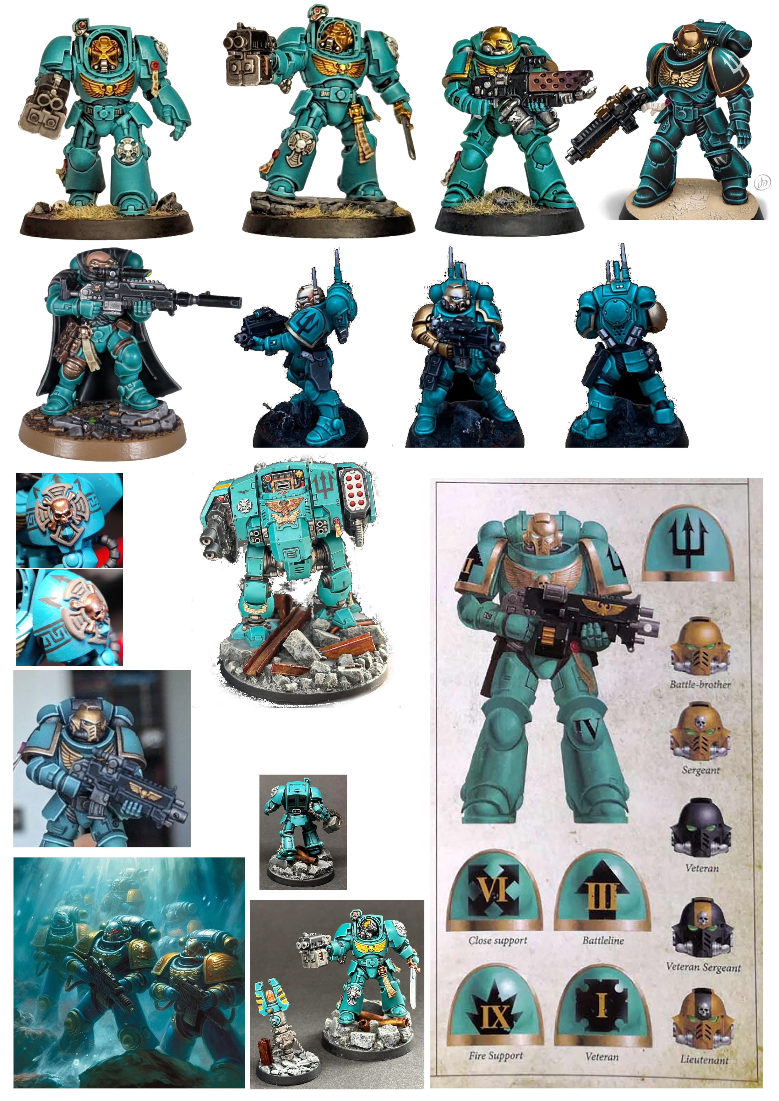
You may recall from my last post that I had just finished the Tyranids from the Warhammer 40k Starter Set. Don't get too excited, I haven't finished the Space Marines - but I have started them! I'm going to lay out here how I chose my Chapter and the paint colours, and the process I went through to paint the Infernus Marines. Before I get into that, though, I'm going to rant (a little) about what Games Workshop did with Primaris marines.
<rant>
I don't have a problem with Primaris Marines per se. The crossing of the Rubicon happened whilst I was out of the hobby, but coming back in I could see that pretty much every faction now had easily-available "super troops", and old-school Marines didn't stand out any more. Given the lore, that didn't really make sense. GW had two options - (1) make the Space Marines bigger, tougher and more imposing on the table or (2) make everyone else a bit wimpier. I would have gone for option (1) in their place too.
However, one of the things I really liked about Space Marines in 2nd/3rd edition was their inherent flexibility. These were super warriors in super armour - they could fulfill any role on the battlefield just by picking up a different weapon or strapping on a jump pack. Sure, you had your best-of-the-best 1st company veterans in Terminator armour, your fresh-out-of-the-academy scouts in flak armour, and a few Chapter-specific special units, but otherwise that was it.
But now you have a whole variety of specialised units, each with wildly different armour configurations: Eliminators, Inceptors, Aggressors, Reivers, Centurion Devastators, Centurion Assaulters, Infiltrators, Incursors - plus some I'm bound to have missed.
To me, that makes Space Marines less impressive, not more. Bad move GW;I do not approve**.
</rant>
Which is all to say, I don't mind Infernus marines. They're pretty much standard Tactical marines with big flame throwers.
Which Chapter To Choose?
I had two key criteria for choosing a Chapter:
- Not one of the "big" Chapters
- A new (to me) colour scheme to try
Frankly I'm not likely to collect a massive army, so a mistake isn't going to haunt me for decades. On that basis, I went for Atlantian Spears. A Blood Angels successor Chapter, I liked the colour scheme - or more accurately the variety in colour schemes. Nominally teal and gold, actual examples seem to vary from a Cambridge blue through turquoise, common teal, teal blue and dark teal.
To decide on my colour scheme, I created what the cool kids call a "mood board":
...and then painted up some figures in each of the colour schemes. Now I am no latter-day Howard Hughes, lacking a vast fortune to fund my every hobby whim; actual Space Marine minis were out of the question. Instead I bought a volume-pack of toy soldiers (of the sort found here*) and tried out a number of colours from my Two Thin Coats collection:
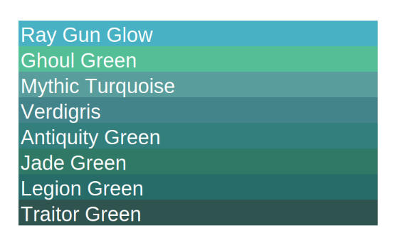
Verdict: Verdigris is a "Special Effect" paint with no guarantee I'd be able to get another bottle, so that one was out. Ray Gun Glow and Ghoul Green were just too bright, as was Mythic Turquoise when actually applied to a model. Legion Green and Traitor Green were too dark, and Jade Green was too... green. By a process of elimination we have arrived at (drum roll) Antiquity Green!
Step 2 - the complementary metallic colour; and here I actually remembered to take some photographs:
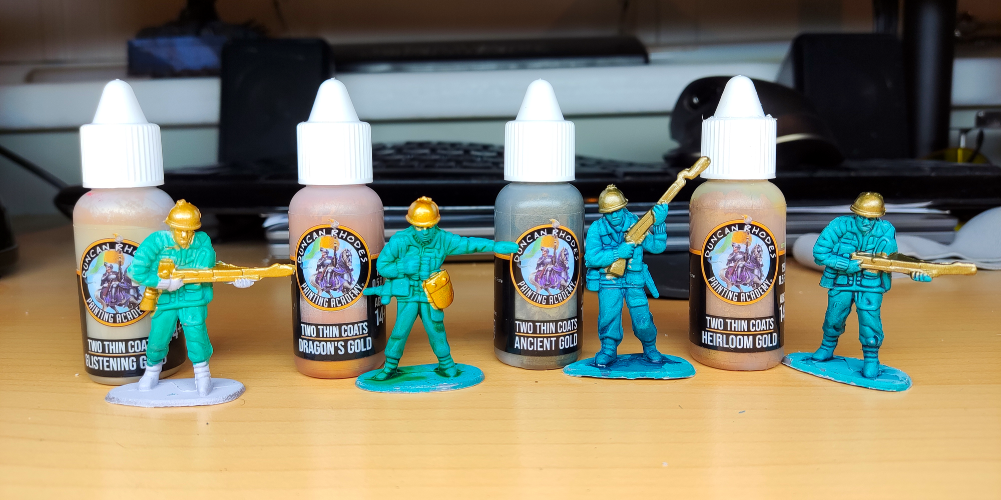
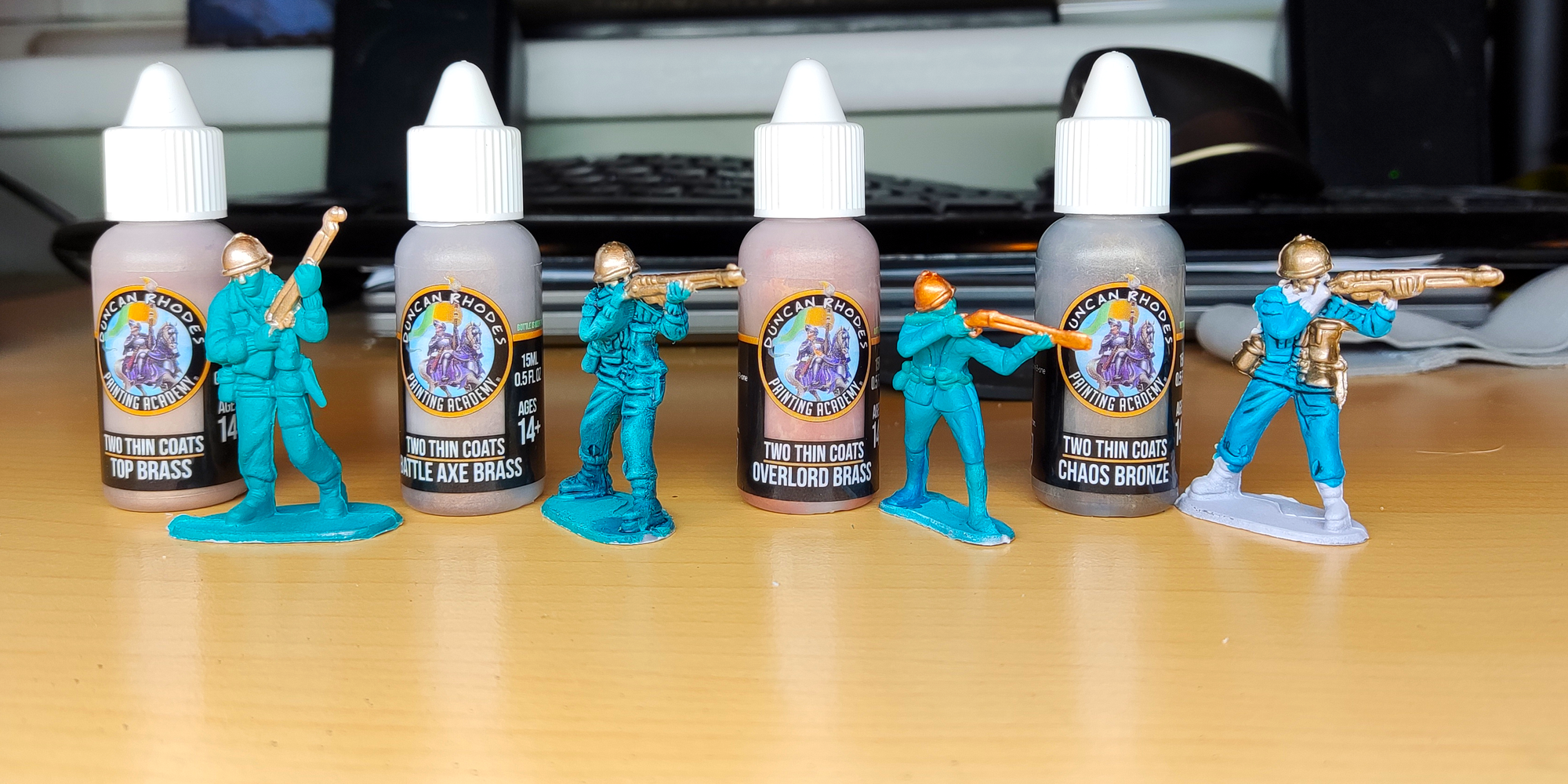
The most canonically accurate colour combination is probably Mythic Turquoise and Glistening Gold - but for me the Ancient Gold just paired really well with the Antique Green.
Step 3 - the shadow/wash colour. With the metallics I painted any soldier I had to hand, but this one required a consistent base coat - so I dutifully repainted a bunch of the soldiers in Antique Green, and then applied various washes:
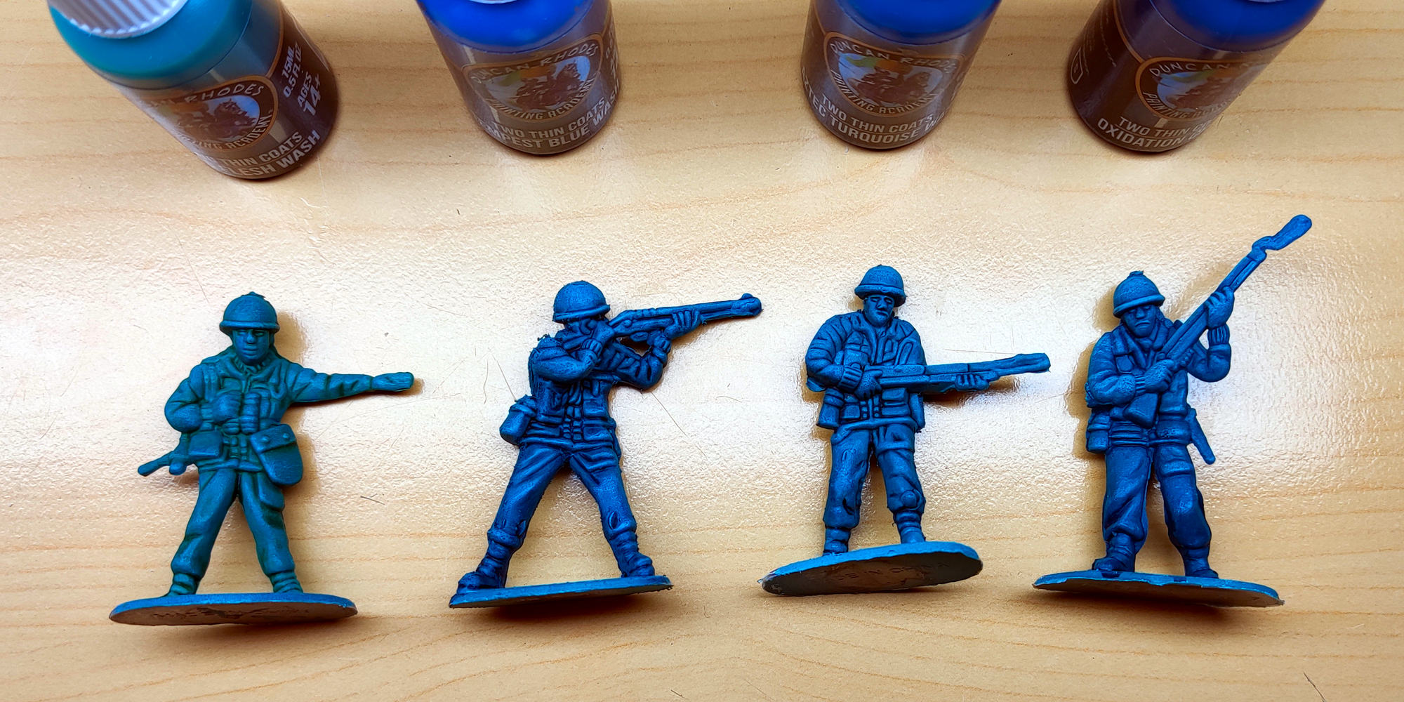
In case the colour names aren't obvious, they are (from left to right) Orc Flesh Wash, Tempest Blue Wash, Aztec Turquoise Wash and Oxidation Green (thinned with water). Perhaps not easy to tell from the image, but the Tempest Blue Wash resulted in the greatest depth of colour and clearest contrast.
Using the TTC Triad system, that gives me:
- Base colour: Antique Green
- Highlight colour: Mythic Turquoise
- Shade colour: Oxidation Green
- Wash: Tempest Blue
- Metallic Contrast: Ancient Gold
Approach
I now knew what I was painting (Atlantian Spears Infernus marines), what colours I was using (Antique Green/Ancient Gold), but not how to apply them.
A technique I've not tried before, but is apparently a fairly basic part of any decent mini-painters repertoire is using glazes to blend between two colours. Time to try! My plan was therefore:
- Base coat:
- Airbrush undercoat (Vallejo Surface Primer Grey)
- Airbrush base coat (TTC Antique Green)
- Building up armour colours
- Wash (TTC Tempest Blue Wash)
- Glazing (TTC Oxidation Green > TTC Antique Green > TTC Mythic Turquoise)
- Edge highlights (TTC Mythic Turquoise)
- Armour Trim
- Base coat: TTC Ancient Gold
- Wash: TTC Flesh Wash
- Drybrush: TTC Ancient Gold, TTC Glistening Gold, TTC Sir Coates Silver
- All the other bits...
Progress Pictures
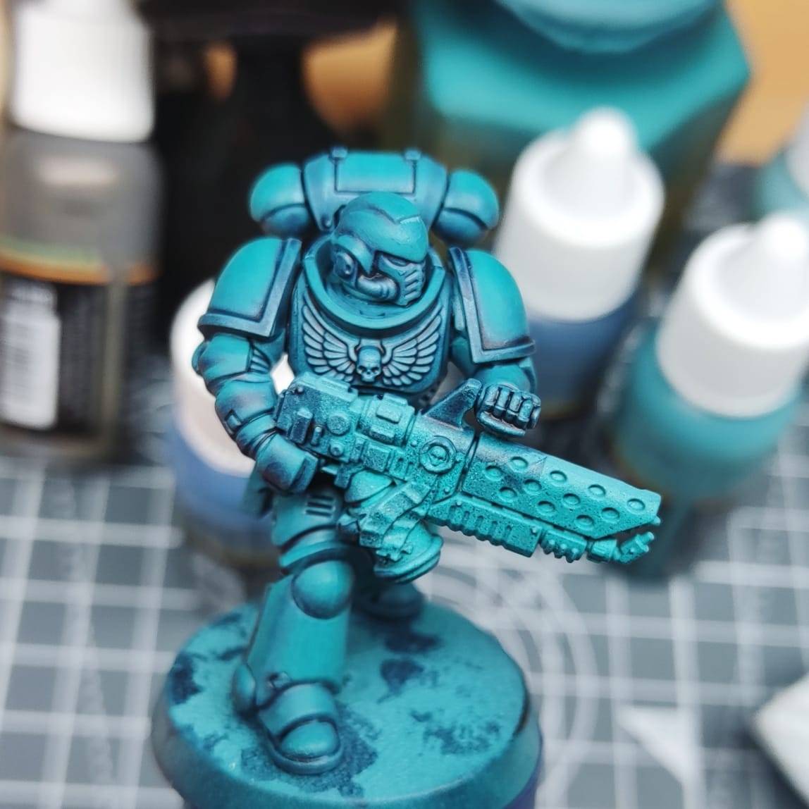
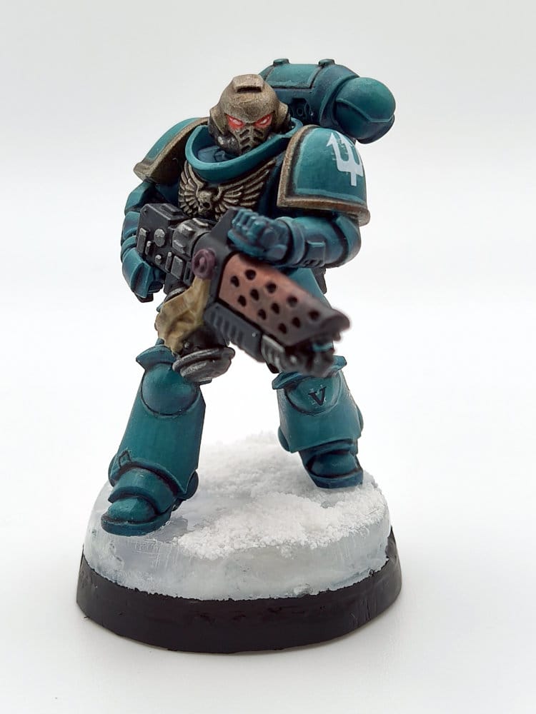
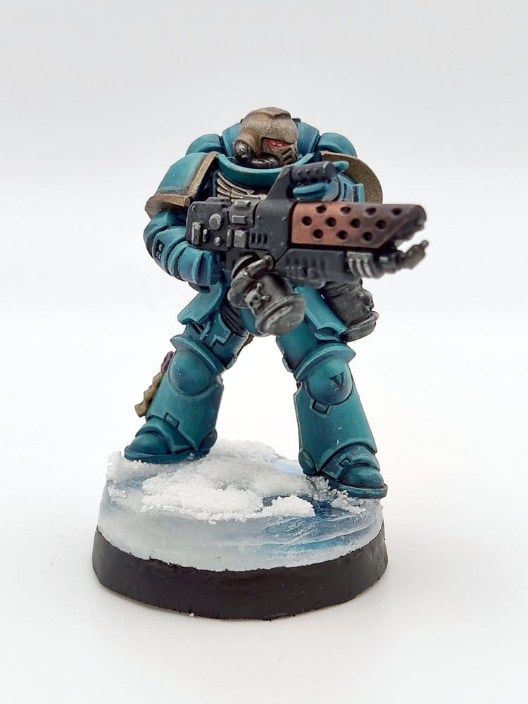
This was my very first attempt at the glazing, and it came out okay. It took ages but there's definitely a colour gradient there. Here's a later model, with the edge highlighting and gold trim:
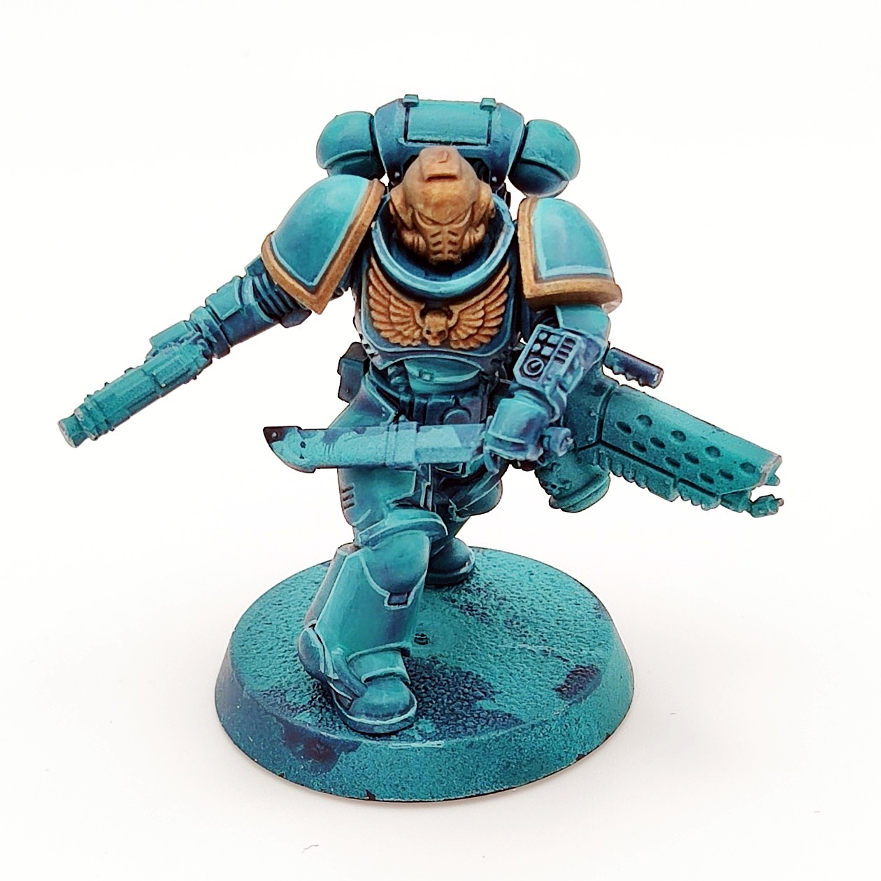
I think you can see some progress there, with a better gradient certainly on the shoulder pads.
The next step was to fill in the detail, and then try another new technique - pin washing with oil paints! My process (informed by multiple half-remembered online tutorials) was:
- Apply a thin layer of gloss varnish to all the parts of the model where I want the shade to flow
- Mix up a tiny amount of black oil paint, thinned down with a lot of artists paint thinner***
- Use a fine tip brush to "dot" the wash into creases, and watch it magically flow along the crease lines
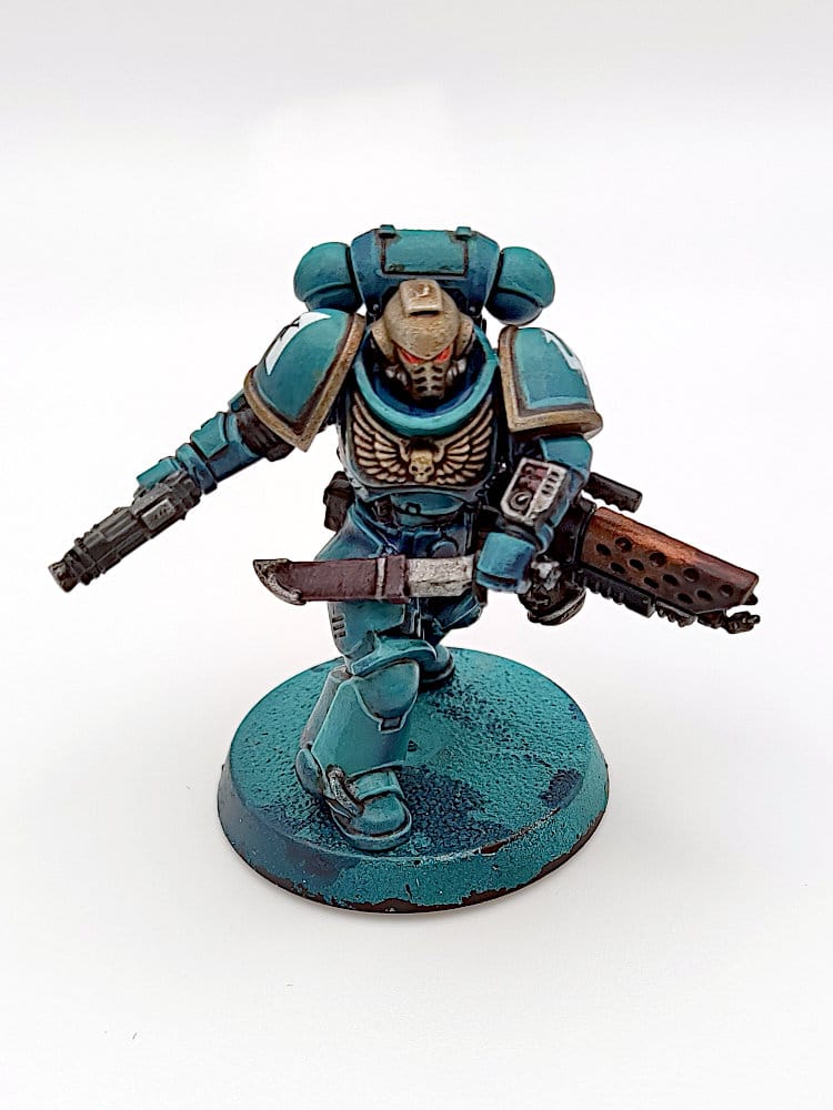
It worked... okay. It took a bit of practice to get the consistency of the oil wash right, and to work out what creases the wash would flow into. Also, I found that the cotton buds I had were far too fluffy for any sort of accurate clean-up, so a lot of the models ended up being a bit "grimy". Something to try again, but which needs more practice!
The final piece of the puzzle was the bases - and I decided to go for a "snow and ice" theme, as the white should really contrast with the turquoise of the armour. Another experimental technique coming up:
- Paint the surface of the base in swirling mixtures of white, grey and blue.
- Stick a short tube to the top of a spare base, with about the same diameter as the base. Create a silicon mould around the base/tube. This will allow us to build up layers of "ice".
- Fit the painted base into the mould, and pour in a ~2mm thick layer of clear UV resin. Use a UV torch to harden the resin.
- Scratch the hardened resin surface to create the illusion of cracks.
- Pour another ~2mm thick later of UV resin and cure.
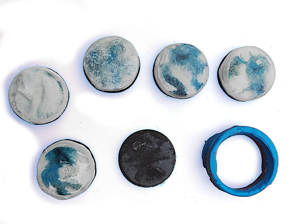
I tried a few different approaches - varying the UV layer thickness, mixing in some white pigment to the resin, heavier scratching, getting white paint into the scratches
The final final step was to add snow to the bases and attach the marines:
- Apply a thin film of superglue to parts of the surface, and tip on some fake snow.
- Apply a thin film of PVA to the dried snow, and add more snow!
- Brush any loose snow away, and apply gloss resin to the visible ice
The results...
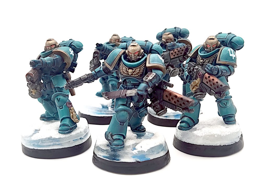
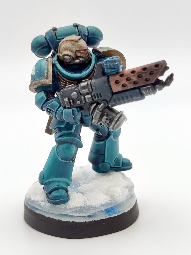
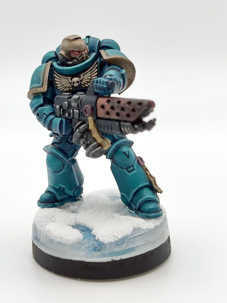
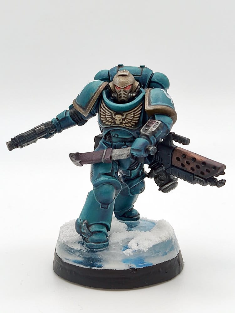
Given this is the first time I've painted marines in ages and I tried out a bunch of new techniques, I'm happy with the outcome. Lots learned, lots still to learn, lots of fun had. What more can I ask?
* I don't encourage you to buy from Amazon, but I make no judgements - I am slowly trying to kick my own Prime habit.
** I fully recognise that my approval is of absolutely no consequence to Games Workshop, and nor should it be. With a 23/24 revenue of £540m and an operating profit of £200m, my disapprobation is causing precisely no-one to lose any sleep.
*** which I assume is just re-labeled white spirit with some sort of odour control, but I had some to hand so didn't want to risk it on my first go